Design a social app from the ground up
UX Research & Design @ Qrated - 9 months

Contribution
UX Design, UX Research, User Flows, Prototype, Information Architecture, Wireframe, UX Workshop, Usability Test
Product
iOS social app
Status
Launched on App Store
Overview
Our mission was to address the needs of LGBTQ2+ college students in North America, who often seek online peer support and lived experiences from fellow queer individuals to find acceptance and belonging. However, we observed a scarcity of apps allowing users to share or discover LGBTQ2+ stories, as most existing apps are primarily focused on romantic or physical relationships.
In this project, As a result, we created Neesh app (previous Shoutout) aims to provide a safe and affirming online space for LGBTQ2+ college students. I took the roles of both UX researcher and UX designer. Our team conceptualized and developed the mobile app, taking it from its initial stages to a functional app.
What makes this project important?

Inclusive Design

Comprehensive user research

Start from scratch
Challenges

Recruiting participants for user research

Building connections with local communities

Building the developer team
User Interview
To refine our focus beyond the broad mission of supporting the LGBTQ2+ college community, I conducted 14 rounds of user interviews with local community leaders and students. Here are a few findings from the research:
Community leaders's concerns:

How to protect community members from cyber stalking and harassment

Their current community platform is NOT under the protection from school

The significantly increasing needs for online activities
Community members' concerns:

Feelings of unfamiliarity as international LGBTQ2+ students

Lack of sense of belongings

Difficult to connect with people with similar minds or past experiences
The Problem
The user interviews helped us pinpoint the problem:
Queer college students are looking for a positive affirming space to gain peer support for the sense of belonging and advice from lived experiences of other queer individuals and alleviate their anxiety about finding acceptance in themselves and in society. However, there are few apps that let users share queer-specific stories or easily find others’ stories in the LGBTQ2+ community. Plus, LGBTQ2+ social apps are geared toward romantic and/or physical relationships.
Product Goals
To address these problems, we are focusing on three key goals to ensure the product is effective:

Safe and Affirming
Provide a safe and affirming digital space for LGBTQ2+ students.

Resourceful
Offer access to relevant information, tips, and peer support
Sense of belonging
Create a community that gives a sense of belonging.
Competitive Research
We researched most products with the similar product vision in the market, including TrevorSpace, Q Chat Space, Soulmate, weBelong, Spaces, Hornet and Lext. We found a lot of opportunities to provide a better experience, because our competitors:

Contain too many suicidal postings and swearing.

Only provide vulnerable safety protocols.

Lack of content discoverability.

Have clunky UI that won't interest young generations.

Have inadequate regulation of sexually explicit content

Have too many scammers and spam
Iteration 1
Wireframe & test: Tag System
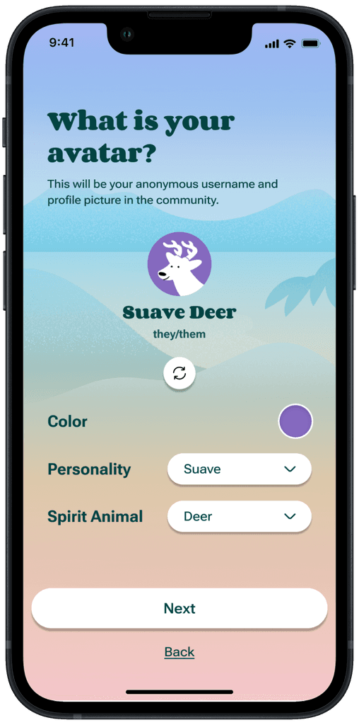
To facilitate user discovery of relevant community topics, I developed a low-fidelity prototype centered around a tag system. This enables users to search for tags, explore topics associated with them, post content tagged with specific topics, and browse a feed curated based on these tags. Below are the key UI pages from this low-fi prototype.

Feed

Post with tags

Search tags

Topic
I conducted the initial round of usability testing among LGBTQ2+ college students to help the team develop a robust tag system that efficiently and accurately distributes content. This process included user testing and card sorting activities to refine our approach. Click the link below to view the comprehensive usability study plan, process, and results:
Usability test #1 documentations
Here is a quick overview of the usability study of this design:
All the users understand the tag system pretty well.
Users like the fact that tags will help them to follow like-minded people.
The “be friendly to people” makes users laugh.
Users like the tag is colour coded.
A user has trouble understanding the tag filter feature.
Most users have trouble understanding some of the LGBTQ2+ glossaries.
A user suggested to add a tag suggestion box in case someone does not feel included.
3 user have difficulty understanding the meaning of Meet Peer Support.
Iteration 2
Visual design & usability test
I integrated previous user feedback, refined the prototype, and collaborated with the team to finalize feature designs. This phase included creating an interactive prototype and conducting usability tests focusing on key app flows such as live convo, the tag system, and user profiles. We also gathered insights on user perceptions of visual design and UX copy.

Feed

Post with tags

Search tags

Topic
In this round of usability testing, I introduced additional qualitative methods, including the System Usability Scale (SUS) questionnaire and product reaction cards activity, to capture user sentiments effectively. Furthermore, I conducted a workshop to create a user experience map, enhancing our understanding of users’ emotions and frustrations while using the prototype. For more details, please refer to the test documentation linked below.
Usability test #2 documentations
After analyzing the test results, we identified 47 areas for improvement and prioritized them based on severity. The app achieved an overall usability score of 86.67/100 according to the System Usability Scale survey. During the Reaction Card activity with users, 93.33% of the reactions were positive, with users describing the app as easy-to-use, integrated, and comprehensive.
improvements
usability score
positive reactions
Iteration 3
Improve legibility
As accessibility became paramount, I refined the key UI design under different font sizes to ensure the interface won't break. In order to ensure the reading experience for users, especially those who have vision impairments, I conducted 18 legibility tests.


Convo page under different font sizes
Even though we recruited random test participants in the campus, we found that 77.8% of them had shortsighted vision loss, emphasizing the need for font size adjustments. This phase unearthed intriguing insights, including user preferences linked to primary language font size and the impact of font size on perceived vision health. Below is the findings:
77.8%
users have vision loss
Same
preference on font sizes
83.3%
users are ESL students*
*For users who use English as second language (ESL), they may have varying preferences for font sizes due to differences in actual character size across different language systems.
check out our legibility test documentations


Live demo
The app is still in the review process of App Store. Here is the Figma prototype to the main features.
