
Improve Streaming Data Visualization Customizations
Timeplus is a streaming-first real-time analytics platform. We empower developers to build powerful and reliable streaming analytics applications at speed and scale.

♦︎ Summary
As the lead designer for the streaming data visualization features, I designed, iterated, and collaborated with the development team to deliver the final assets for production.
Introduction
The project aims to enhance the user experience of data visualization customizations. The current user flow is inadequate to meet the increasing complexity of customization features. Therefore, the overall plan is to improve the customization flow, redesign the configuration panel, and add more customization options.
Priority Matrix
High Impact
Streaming data visualization is facade of our product, acting as a compelling selling point that drives revenue.
High Effort
The project consists of a legacy design that needs to be improved and a series of new features to be added on.
Challenges

New domain
Learn designing a product for coders as a non-coder designer.

Tech restrictions
Design in a constrained data visualization framework.

Full of ambiguity
The project started with an ambiguous scope.
♦︎ Discover
The most urgent problems that we needed to resolve at the beginning of this project is optimizing the data visualization customization flow.
Problems


Poor Usability
The customization configuration settings were split between two separate sections (A and B), making it difficult for users to locate and modify the settings.

Limited scalability
As we added more customization features, the customization settings (A) became increasingly crowded, which would further complicate the user interface.

Complexity
The configuration process followed a purpose-driven user flow that made sense for simpler visualization types, but became increasingly convoluted as we added more chart types.
★ Further DIAGNOSE
What went wrong?
Our original approach to generate a visualization for our users is automatically suggesting a chart type that fits users' scenarios based on their purposes. It facilitates quicker decision-making for our users, especially for those who are not expertises with data visualizations.

The old Purpose-driven model
However, it results in serious issues. For example, this old purpose-driven user flow for selecting a visualization type becomes unnecessarily long and complex when the system fails to suggest a suitable option, especially as we expand support for more types. This can hinder users from quickly and reliably identifying the appropriate chart type to represent the data relationship.

The old user flow
♦︎ Define
User Goal
To establish a clear user goal, it's essential to identify the specific user group we're targeting across different stages. In the case of this project, our target user group comprises individuals with data analytics expertise, particularly data analysts, who has a keen understanding of selecting the appropriate chart types to construct the visualizations they require.
As a result, automatically suggesting chart types is no longer as necessary as before and we could redesign the experience for a more fluent customization process and a better consolidation for the new customization features.
Target users
Data analytic experts
Goal
Enhance the user experience of
data visualization customizations.
Business Goal
Our business goal is to increase service purchases by improving the overall experience of data visualization in our product. Since charts are a major selling point for our customers, who value the ability to perform streaming data analytics, enhancing the usability and customization options for building data visualizations is a key part of our product strategy.
User flow

The new customization user flow
Shifting away from the initial purpose-driven user flow, we realigned to focus towards a more specific audience—data analytics professionals. These individuals possess a keen understanding of selecting the appropriate chart types to construct the visualizations they require. In the revised flow, we no longer recommend visualization types based on their purpose, streamlining the customization process and significantly reducing mental complexity.
♦︎ DELIVER
Final Design
The design underwent multiple iterations before being finalized and delivered. If you're interested in learning more about the project's journey and the various design decisions that were made along the way, please don't hesitate to reach out to me on LinkedIn.

The mandatory data binding options are in the default view for quick access.

The format panel primarily governs the appearance and style of visualizations. Note that the available options will dynamically adjust based on the chart type selected by the user.

Customizations (Table format)

Dashboard
★ Features Explained
A closer look at the redesign and new features

Adaptive customization panels
The customization (format) panel adapts to the chart type the user picked and provide the most useful available options.
For example, a time-based chart includes options that controls time range that the users want to show on the X-axis. While a table includes options for how to display data in columns.

Conditional formatting
Users can define formatting rules based on data values, such as highlighting cells with values above a certain threshold.

Value trend
Users can customize the colors used to represent different trends in data, which is particularly useful for accommodating cultural differences.
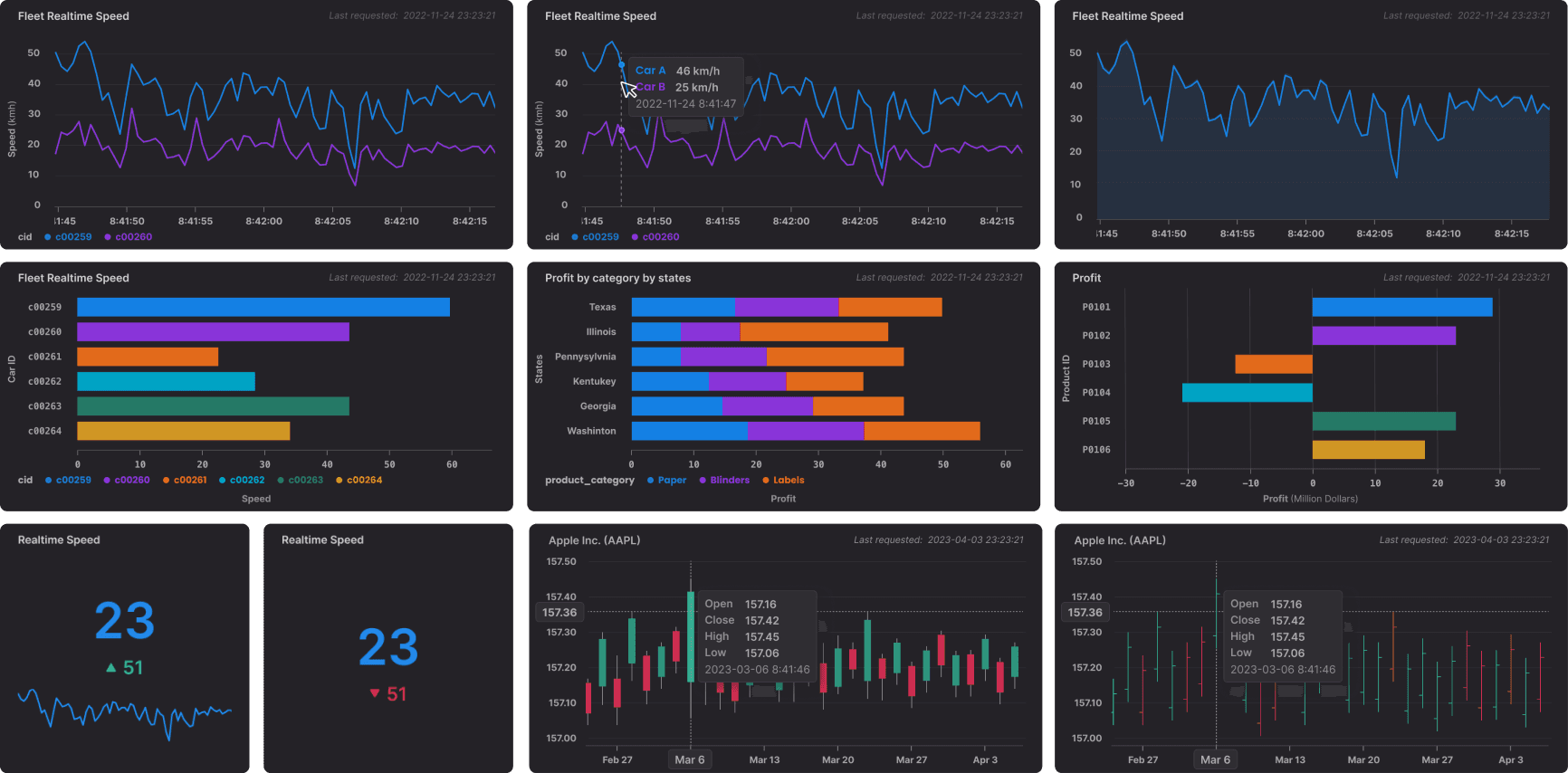
An overview of chart design
Retrospection
Working in an engineer-driven company is very different from working in a design-driven company, and this project has taught me some valuable lessons:

Adopting expert review
Adopting expert reviews in the design process proved to be crucial in ensuring that our design solutions aligned with technical constraints and requirements while also incorporating valuable product visions from developers who have extensive experience.

Bringing UX perspective to the table
Working in a situation where the Scrum Master and the Product Owner roles are combined presents its own challenges. The convergence of these roles can sometimes create conflicts of interest. As a result, it is crucial to bring in the UX perspective and help the individual understand the value of UX.

Seeking crossed industry user research
To ensure a more user-centric approach, we need to recognize the importance of dedicating additional time to researching customers from different industry backgrounds. A research-driven approach enables us to tailor our design solutions effectively and ensure their specific needs across industries.

Achieving alignment within the leadership team
The company achieved a new level of alignment and gained a much clearer understanding of our target audience, significantly impacting the creation of the user flow.


